
Chances are, at some point in your life, you’ve engaged with online forms - be it through a mobile app on your iOS or Android device, your desktop or even the traditional pen-and-paper format.
Forms consist of several different fields, each accompanied by labels and texts that need to be filled with relevant data. They are used to gather essential data in a logical and meaningful way, facilitating seamless communication between the parties involved.
Forms are everywhere. From food delivery to travel bookings or event registration, they seamlessly integrate into the services and products we rely on daily. Whether you own an online store, run an airline company or simply want to gather customer feedback, your main goal is to help them click "Submit" or "Buy now."
By building an easy-to-use and understandable form, you are not only simplifying the user's journey, but you are also setting yourself up for success. User-friendly forms are easier to navigate and complete which can lead to a smoother and satisfying experience for the user. User satisfaction can then be translated into a higher completion and conversion rate which is highly beneficial for the growth of any business.
Designing UX forms
When designing forms, many things must be taken into consideration which makes it more challenging. In some scenarios, we need to grab the user's attention for quite a long time which can be quite overwhelming for the user. To make things easier for the user, it’s recommended to use a shortcut whenever possible. One way of doing so is to allow them to create a new account by linking their existing accounts, such as Google or Apple ID.
There are many other ways to make the user experience quick and easy. Here are 10 techniques that will help you design easy-to-use UX forms.
1 - Field input type
Use different input fields to help the user understand what information they need to provide (date of birth, mobile number, etc). This will help you gather all the information correctly and create an organised database with correlated information. As shown below, it’s best to provide selection boxes where the user can pick from the available options or receive guidance on the type and format of data to include. This will make it easier to collect data and thus reduce the chances of mistakes.
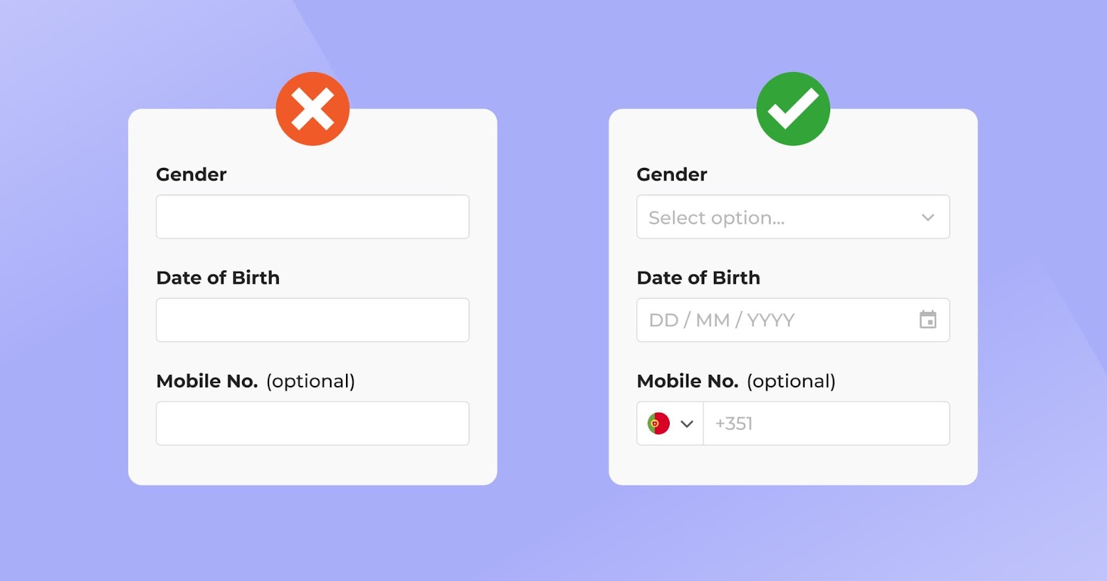
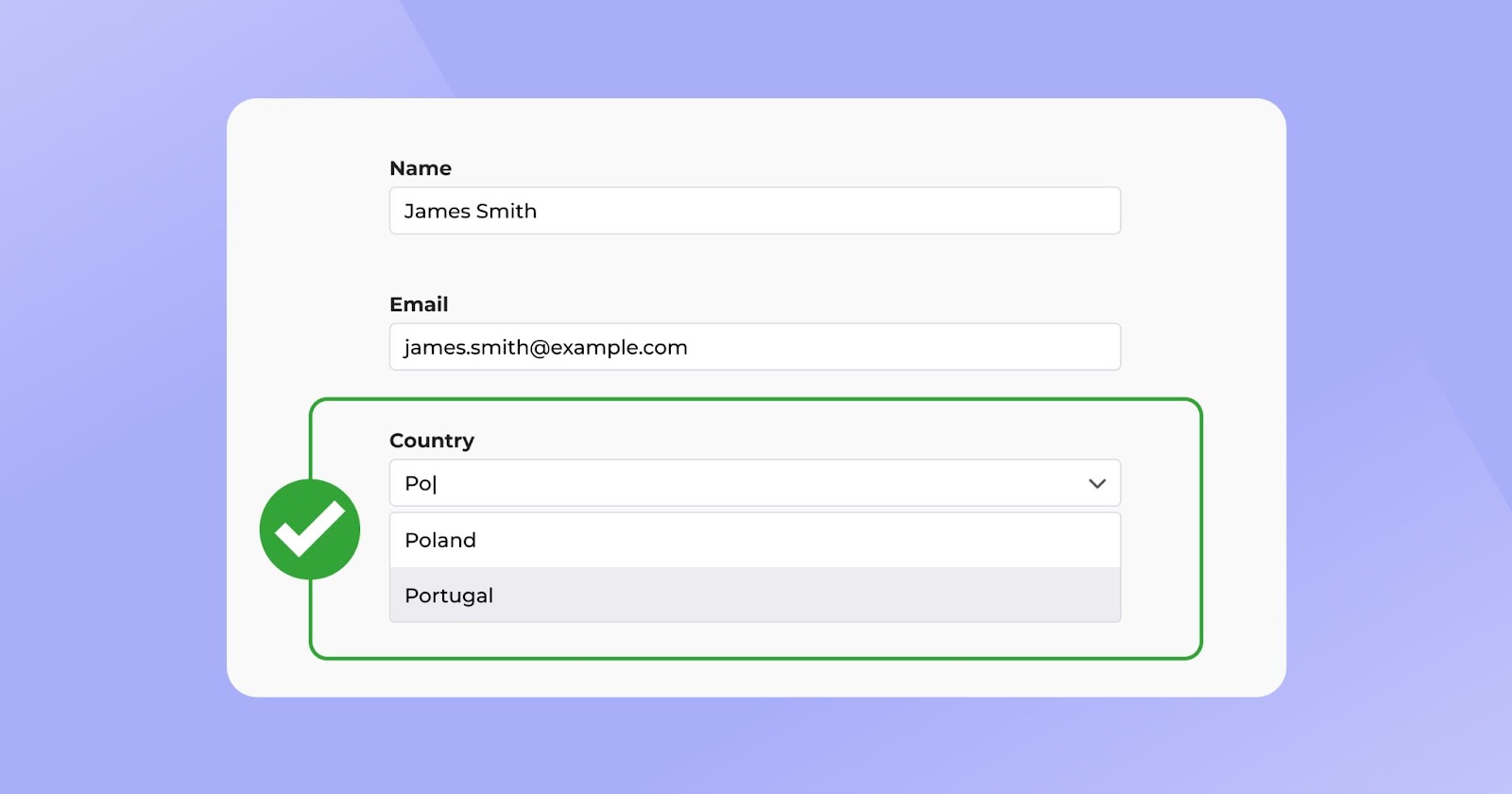
Another example is a predictive search that displays results based on the user’s input. When the user starts filling in the field, a list of available options appears which speeds up the process for the user and guarantees you collect consistent data from all users.
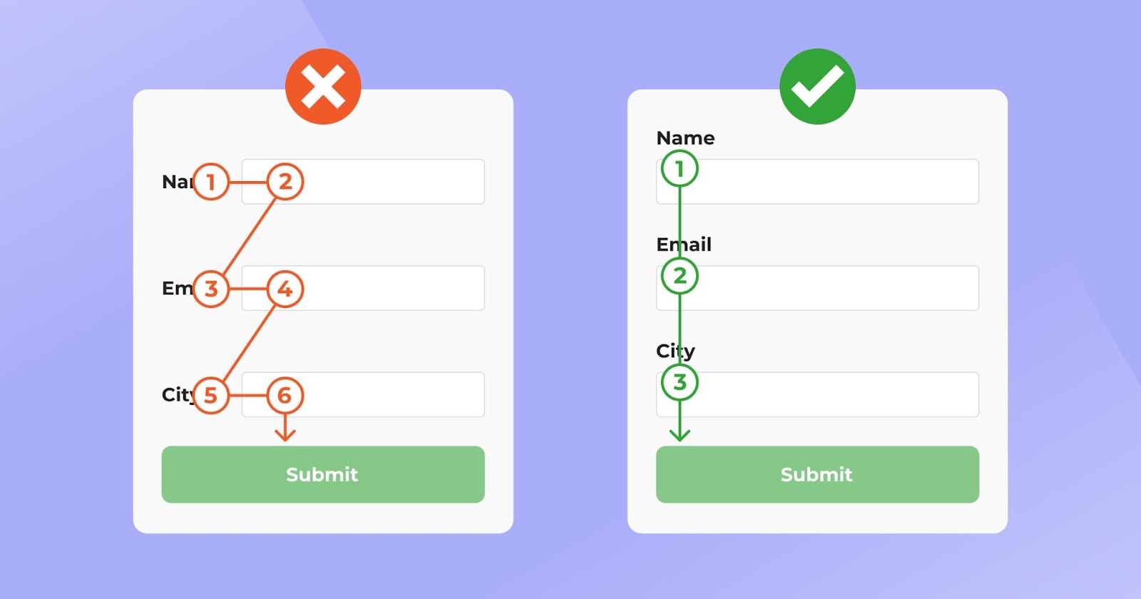
2 - Aligning sections
Aligning sections may seem like a tiny detail but in reality, it makes a huge difference. The idea is to make a form easier to read by putting all the information in one direction.
Users are most likely to look at your information vertically, as it's faster and more efficient to understand all the information. With this in mind, ideally, you want to make the field names of your form vertical which will make it more accessible and help you limit any potential errors in data collection.
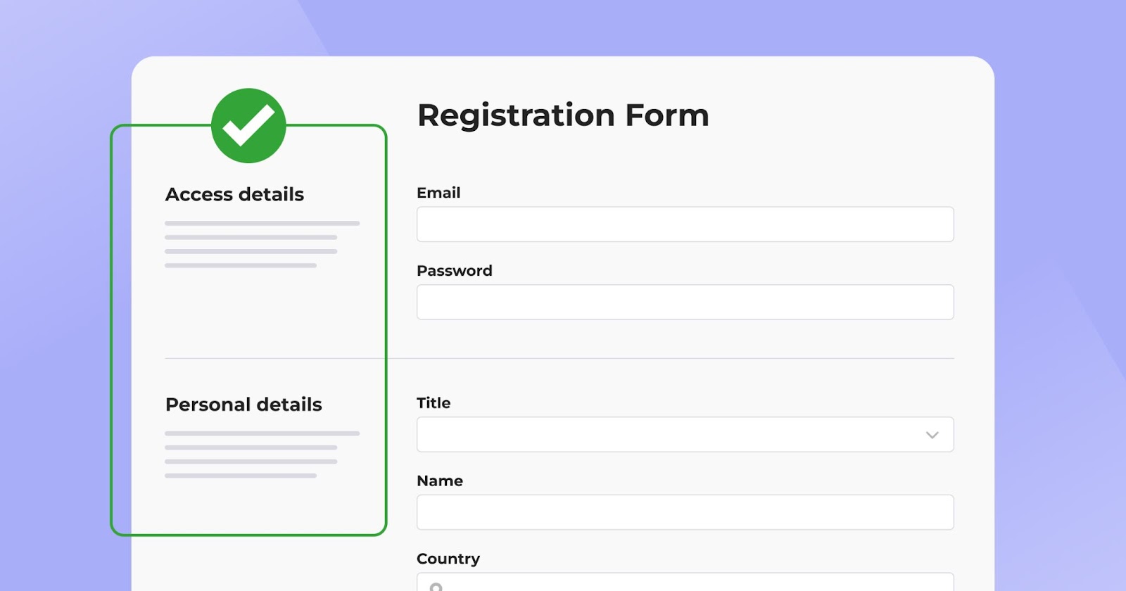
3 - Group fields
Sometimes, forms can be very long and complex so it’s best to have clusters of information that contain titles, subtitles, or even descriptions that can facilitate the user's experience. By organising the information into blocks, the user can quickly connect each type of information.
With the main information located vertically, any additional information or instructions can be added to the left section. When adopting this method, make sure you leave space between each section so the user can easily tell which one it is.
4 - Write clear labels
The labels should be simple and easy to understand so that the user can quickly see what information to put in each field. Use simple labels to explain simple fields and add as few words as possible for each label. Here’s an easy example: use the “Full Name” label instead of “My name is”.

5 - Add visual cues
Incorporating visual cues into the form is another way to enhance the user experience. Captions should be used along with any visual cues to make the form more engaging, accessible and user-friendly.

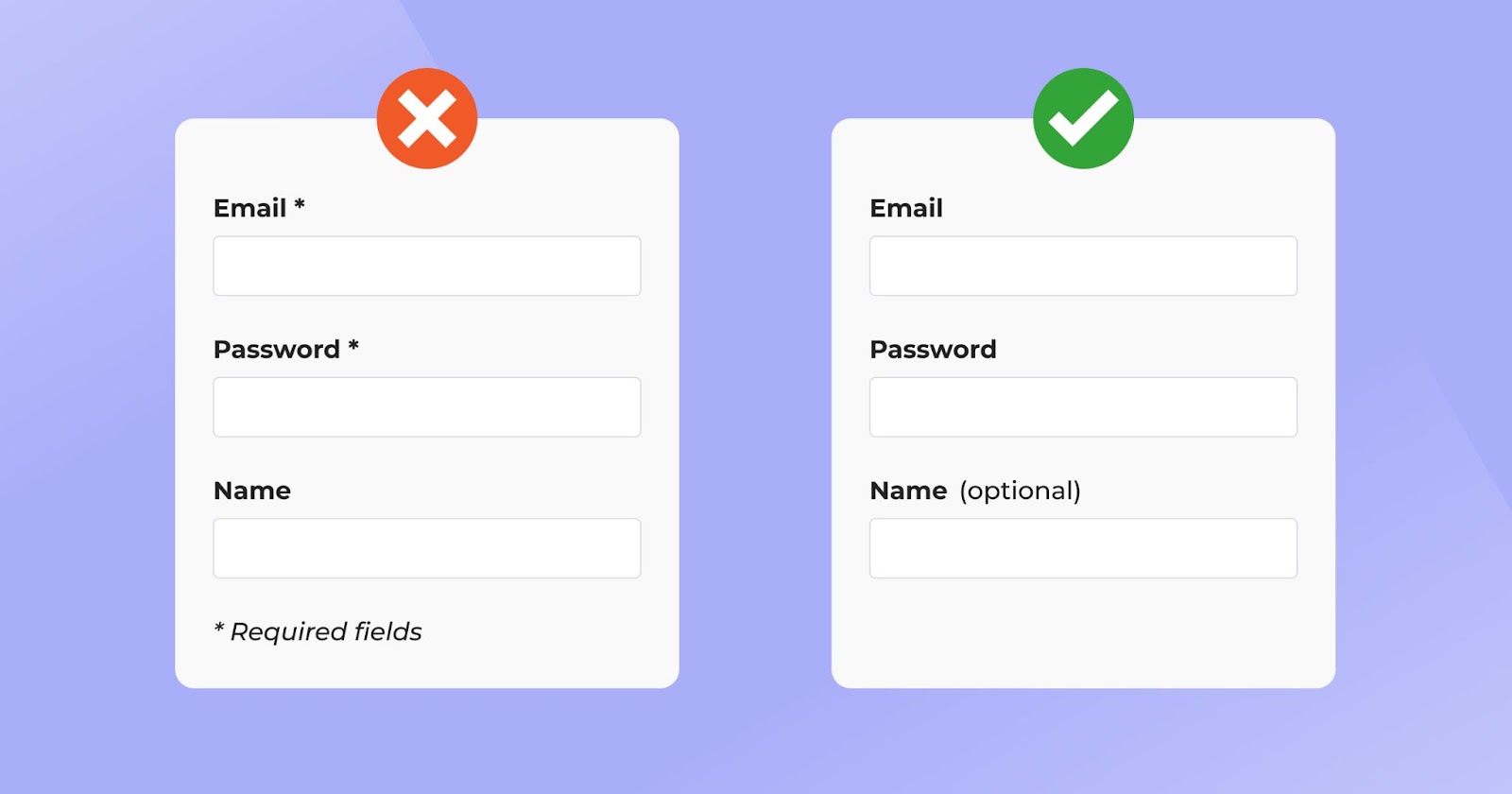
6 - Optional vs. required
When designing forms, we often include both optional and required fields. Typically, we designate a required field by adding an asterisk (*) to it. Although we still find this method applied, it is increasingly being replaced by a different approach that uses words instead of symbols to indicate optional fields. Forms should collect the most important information and have a few optional fields. This will make it easier for people to comprehend the information, without overwhelming them with it.
This method offers a more intuitive approach, particularly for forms that are more extensive and complex.
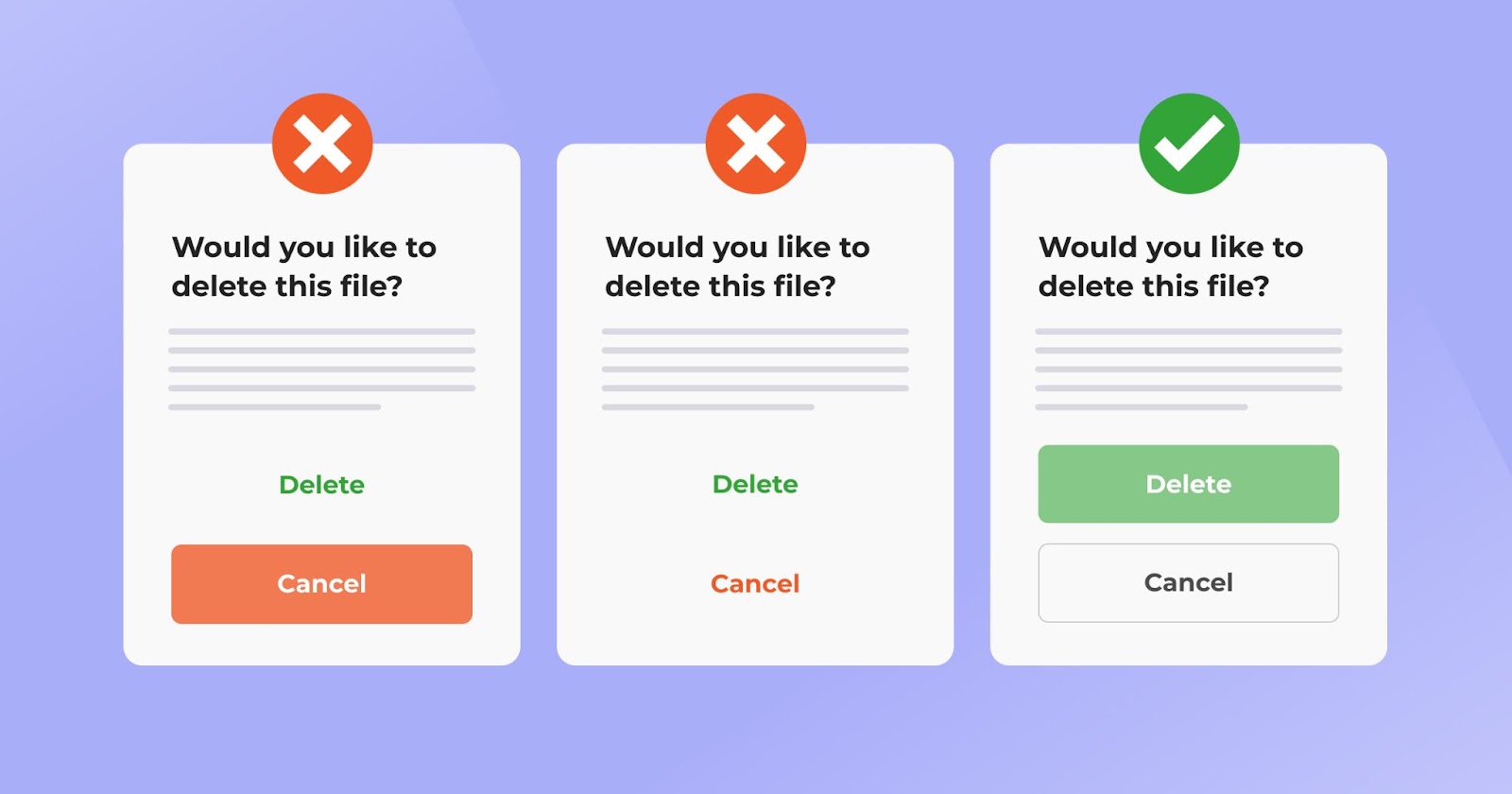
7- CTA conversion
Since the goal of having a form is for the user to complete and submit it, the call-to-action buttons must be well-designed. So, how do we get our user to hit the “Submit” button? The design of the button, its colour, position and call to action (CTA) words are the key elements that we should pay closer attention to.
One important thing to remember is to highlight the button that we want the user to click. By creating an outline and using a prominent colour, we will guide the user to hit the action button. As shown in the example below, a clear button will provide clear action for the user.
8 - Write a clear CTA
A clear and specific call to action is essential, so it must be explicit. The button “Add to cart” in the example below indicates that a product will be added to the
cart. This call to action will give clear direction so the user can then continue their experience.

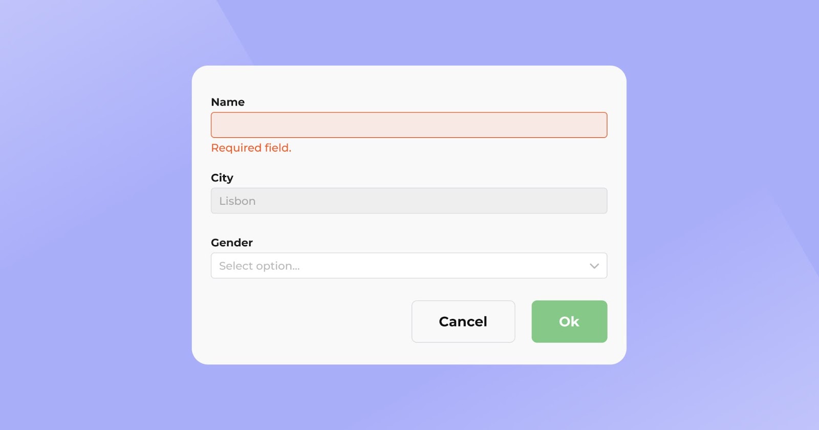
9 - Validation and errors
Before a form is submitted, validation takes place. This means that required fields must be completed and input values must have a correct format. If something is wrong or missing, an error message will be shown to help the user meet the requirements.
Three types of error messages might appear in your form:
1) An error has occurred: It is necessary to clearly show that an error has occurred when filling out the form. Ideally, this message is shown in red colour;
2) Where the error occurred: It is necessary to highlight the field in which the error occurred;
3) How the error can be fixed: Put information on what needs to be different for the form to be validated correctly.
It’s important to note that the list of errors will be read by screen readers making your website accessible. Once all the checks have passed, the form can be successfully submitted.

10 - Colours
Colours will not just make your form look better or more engaging, but they will also make it easier for the user to get through each section faster.
Different colours can be used for different purposes. As mentioned before, red is often used to indicate any errors on the form while light grey can used for any disabled fields that we are not allowed to change (see the example below). A soft tone can also be applied to the whole form background to help the user identify each empty field. You can then use prominent and contrasting colours to make users notice action buttons like “Proceed to payment”, “Submit” or “OK”.
Final thoughts
Easy and intuitive forms tend to have higher click-through rates which can lead to higher completion rates. This is particularly important for businesses that are focused on online purchases and account registrations. Implementing user-friendly forms can allow your business to minimise errors and improve the quality of the data collected. Creating a user-friendly form will simplify the whole submission process and deliver a user experience that encourages your customers to return to your services.
How YLD can help
If you need guidance on UX forms or anything else related to UX and product design, Contact us to discuss the prospect of a potential project.


